
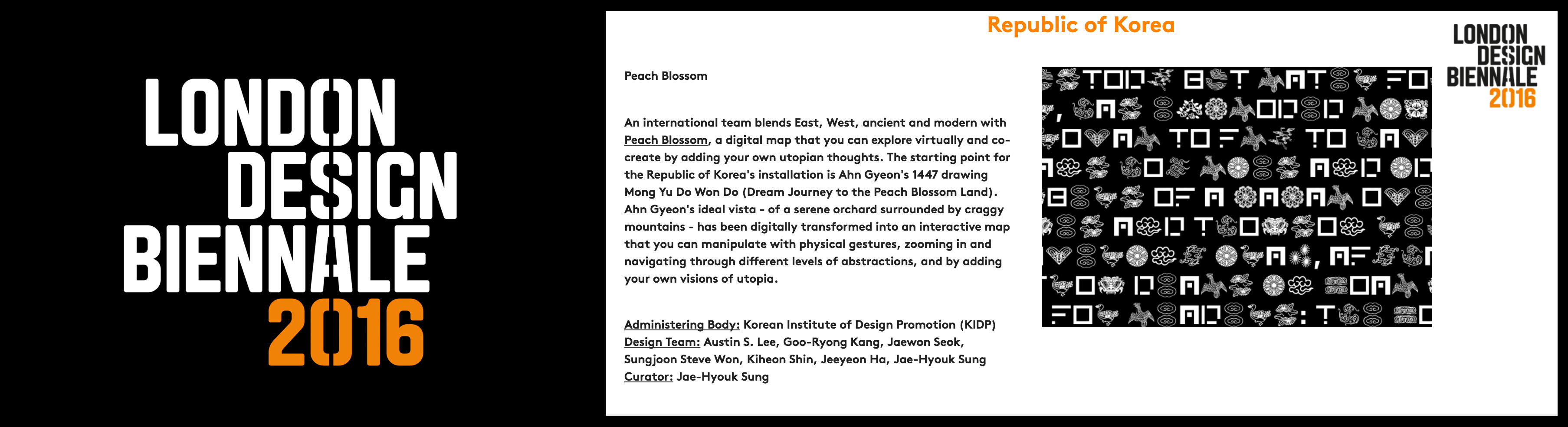
London Design Biennale
Interactive media exhibition depicting utopia.
Member of the creative team representing South Korea in 2016.
Member of the creative team representing South Korea in 2016.
Role
Creative technologist
Year
2016
Team
Team South Korea

Overview
In a team of 7 designers, leading the interaction design and the overall software implementation of the exhibition installation "Peach Blossom" as a representative of the South Korea team at London Design Biennale 2016. 2016년 런던디자인비엔날레 한국 대표팀 멤버로 참여하며 전시 작품 "Peach Blossom"의 인터액션 디자인과 그리고 전시 관련된 소프트웨어 개발을 주도했습니다.
The team consisted of 7 members, with three graphic designers // two interaction designers // and two exhibition designers.
Overview
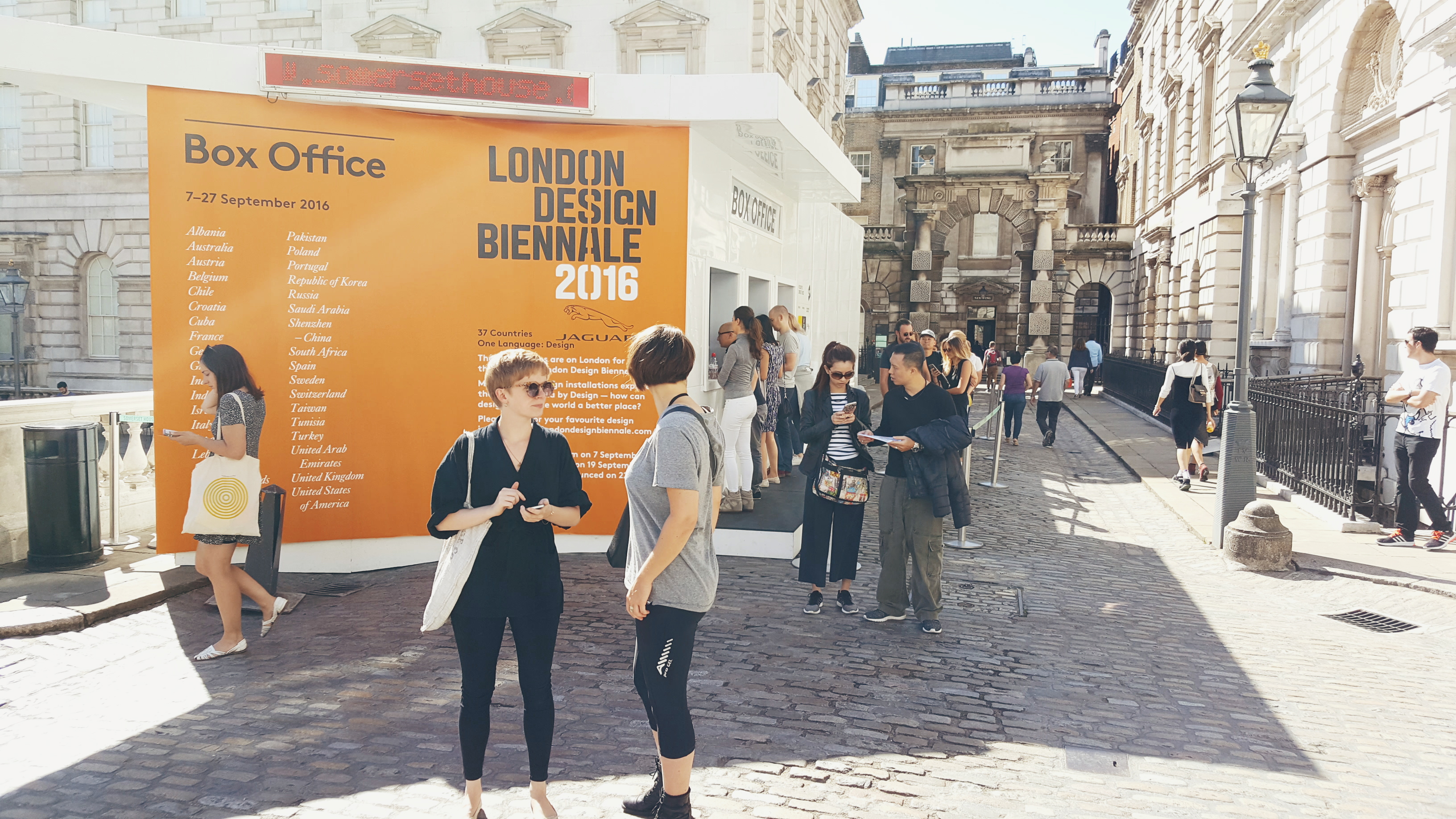
This was the very first London Design Biennale happening, and it is set to take place in London's Somerset House. With 37 countries participating across six continents, every team was commissioned to re-imagine and re-interpret what utopia is through design.
We came together as a team of graphic, interaction, and exhibition designers to realize what this could be in a way that is unique to Korea. What could have seemed like an arbitrary team brought out the best in us throughout the process and the output as a whole. The wide gamut of backgrounds helped us look at and approach the same problem from varying perspectives, and the diverse set of expertise created synergy when we were heads down articulating our vision through design details.
We came together as a team of graphic, interaction, and exhibition designers to realize what this could be in a way that is unique to Korea. What could have seemed like an arbitrary team brought out the best in us throughout the process and the output as a whole. The wide gamut of backgrounds helped us look at and approach the same problem from varying perspectives, and the diverse set of expertise created synergy when we were heads down articulating our vision through design details.
Collaboration process
This project was special in many ways, and one of the areas that stood out was how we collaborated. The team was spread across 3 continents (South Korea, U.S.A., U.K.) and 4 cities (Seoul, Seattle, Pittsburgh, London). Naturally as a result, majority of the collaboration happened remotely during the course of this 9-months project.
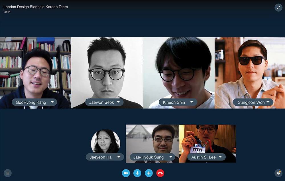
The team was spread across continents. For most of the 9 months project period, we collaborated over Skype. Sungjoon Steve, Austin S. in the U.S // Goo-Ryong, Jaewon, Kiheon, Jae-Hyouk in Seoul // Jeeyeon in U.K.
It was about half-year into the project when we were finally able to create an opportunity to have everyone meet face-to-face. It was also a chance to make sure we were all real people and not bots.
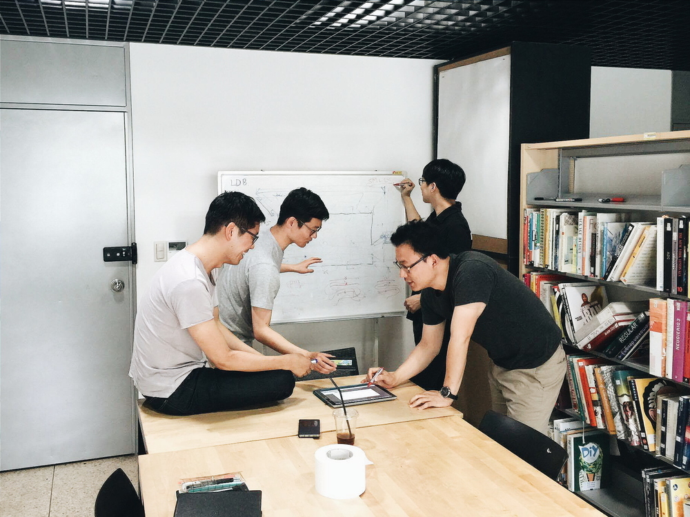
Workshop in Seoul in June 2016 (From left clockwise: Sungjoon Steve Won, Austin S. Lee, Kiheon Shin, Goo-Ryong Kang)
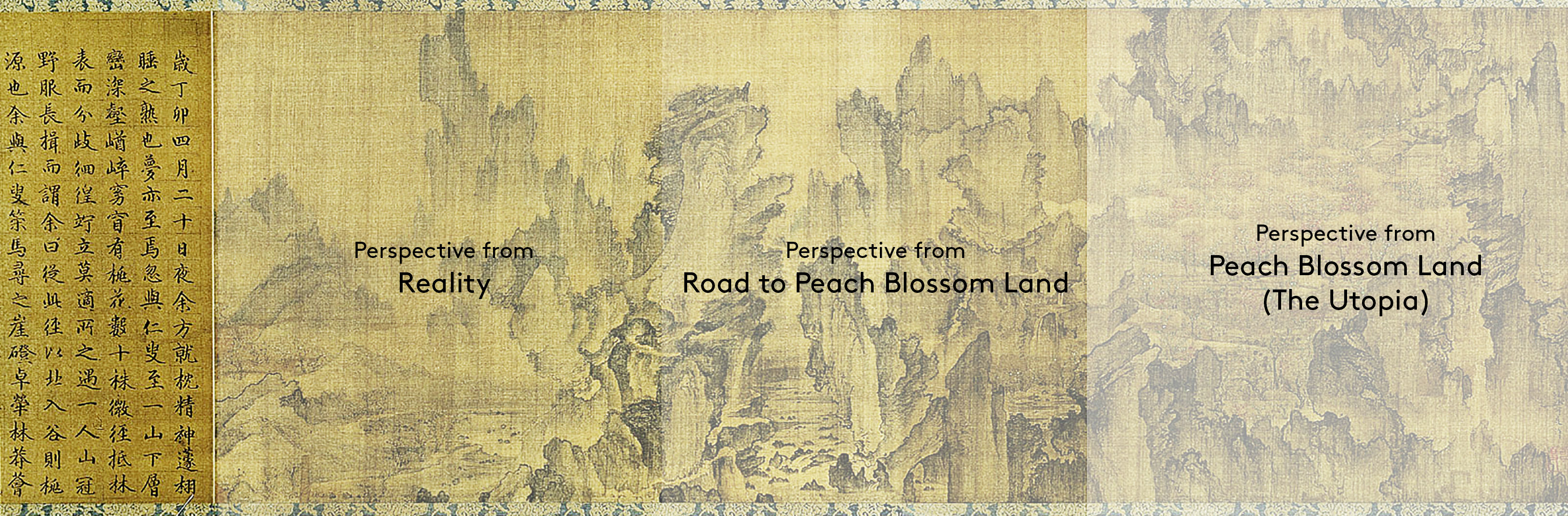
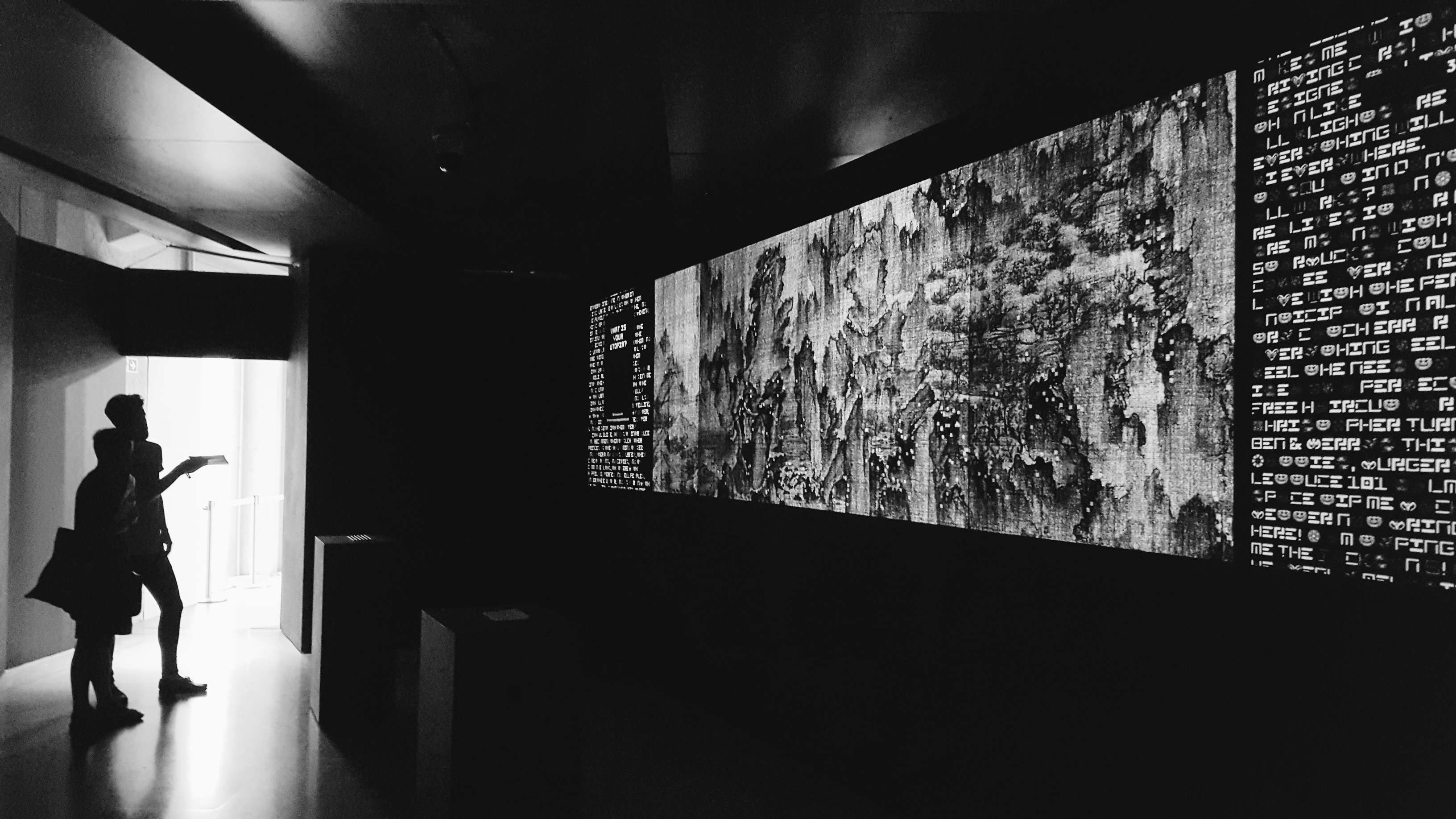
MOTIF: Mong Yu Do Won Do
Slightly prior to the time U.K.'s Sir Thomas More wrote the fiction Utopia (1516), a painting was drawn by Korea's Ahn Gyeon in 1447. The painting's Korean name is "Mong Yu Do Won Do", which translates to "Dream Journey to the Peach Blossom Land" in English. The painting depicts a bird's eye view of the journey from reality to utopia (the Peach Blossom Land) and is drawn in 3 key perspective; The left side being the grounded reality and the Peach Blossom Land being on the right side of the painting,
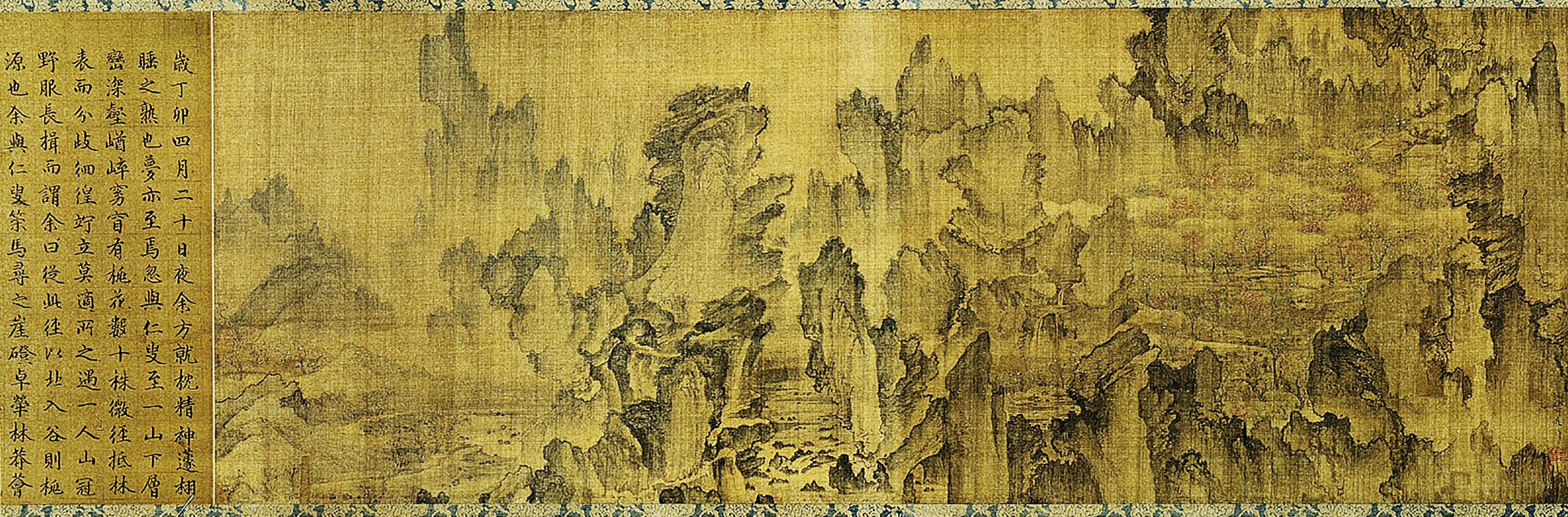
"Mong Yu Do Won Do" by Ahn Gyeon. Year 1447.
Both the painting "Mong Yu Do Won Do" and the fiction "Utopia" were about what people idealized as Utopia at the time, and we became inspired by the idea of blending views of the East and the West through these two pieces.
Direction
We wanted to recreate "Mong Yu Do Won Do" in a way that is interactive and relevant to today. Even though hundreds of years have passed, people still yearn for the idea of Utopia. What if those thoughts could be the recipe (or building blocks) to recreate the painting as a digitized map? Can we breathe in life to a historical painting in a way that people can resonate with? How can we capture modern day people's thoughts into the interactive surface? This vision served as the compass for our thinking throughout the process.
Early explorations
Early on in the process, we've explored two concepts. Out of the two, the below concept resonated with us more.
Concept "Mapping Interviews". This concept focused around a responsive and spatiotemporal map installation with visual narratives.
Both focused on a design experience that breaks the barrier of time, space, and culture by visualizing the reimagined utopia world depicted in the Mong Yu Do Won Do. There are three key components in persist in both installation concepts:
- First is the digital and physical participatory design experience: Both of the installation methods will include an online platform where viewers from remote locations can interact with the piece. The visual element in the physical exhibition area will be interlinked to the shared virtual space.
- The second component is the visual element. Mapping Interviews spatially mapped 2D visual element onto multiple physical surfaces.
- The third element is tangible input: Whether using gestural input, or simple text input via audio or keyboard, the goal is to enable participants in the exhibition space to feel connected to the piece.
While thinking about enabling a similar experience across both concepts, the variation was around how to capture that in different mediums and surfaces.
Refining the design space
As with most projects, we came across a moment where a grounded set of constraints (ex. The space, funding required to enable ideas, lighting conditions, and more) came into play. Rather hindering us from being creative, these variables helped us articulate the context into something more tangible and something we can be creative on / with / against.
In addition, understanding the exhibition space and imagining the paths the audience can take guided us in how to take the early concepts forward. One of the interesting challenges that I've faced through the course of the entire project was how to guide the visitors without constraining them to a specific set of steps. In a digital product (such as a mobile application), it is a lot clearer to convey which step of the experience you are in and provide the right set of context and fences to keep the user (and the system) on track. In an exhibition, it isn't always clear which way a visitor will walk in from and how the visitor will maneuver the space once they enter the exhibition. The flexibility in how much you can walk the user through the piece is also limited (For one, the exhibition piece was to be experienced by multiple people at once. It was difficult to create a walkthrough and interaction guide catered for a single person in that space).
In addition, understanding the exhibition space and imagining the paths the audience can take guided us in how to take the early concepts forward. One of the interesting challenges that I've faced through the course of the entire project was how to guide the visitors without constraining them to a specific set of steps. In a digital product (such as a mobile application), it is a lot clearer to convey which step of the experience you are in and provide the right set of context and fences to keep the user (and the system) on track. In an exhibition, it isn't always clear which way a visitor will walk in from and how the visitor will maneuver the space once they enter the exhibition. The flexibility in how much you can walk the user through the piece is also limited (For one, the exhibition piece was to be experienced by multiple people at once. It was difficult to create a walkthrough and interaction guide catered for a single person in that space).
Setting the concept direction
From the two earlier concept explorations, we've proceeded to further develop the idea of a Mapping Interviews. The experience and the content from interviewing the modern day audience to reconstruct a historic painting was not only intriguing but also was better fitting to the space we were going to project to in London. How can the reconstructed version of the painting look like given the space from far away? At a detailed level, how can we infuse the elements of the East and the West? These questions were some of the key questions that drove our designs as we proceeded onto the tangible forms of our concept.
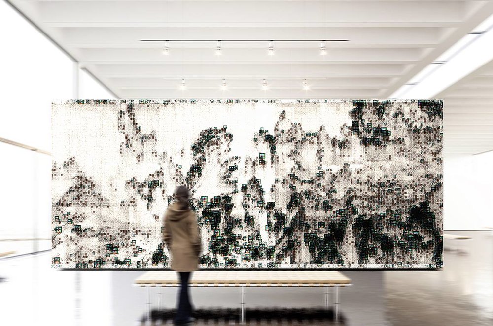
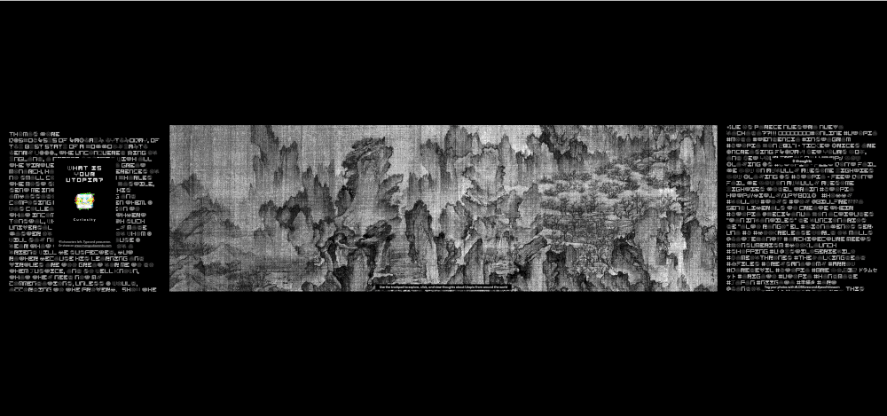
Higher level: Concept of the digitized version of the painting Mong Yu Do Won Do from a bird's eye view
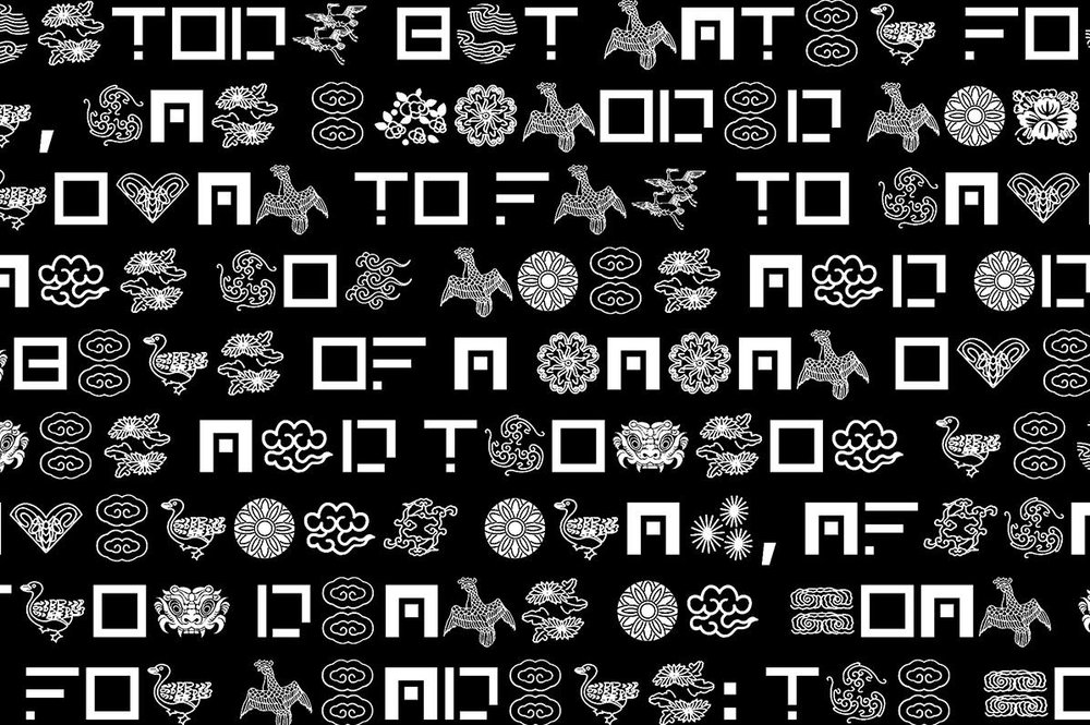
Detailed level: Custom designed font which embraces the elements of Korea in patterns and elements of the West in alphabets. A single typeface that combines both aspects, based on the lower and upper cases of the text. Design of the custom typeface was led by the graphic designers of the team.
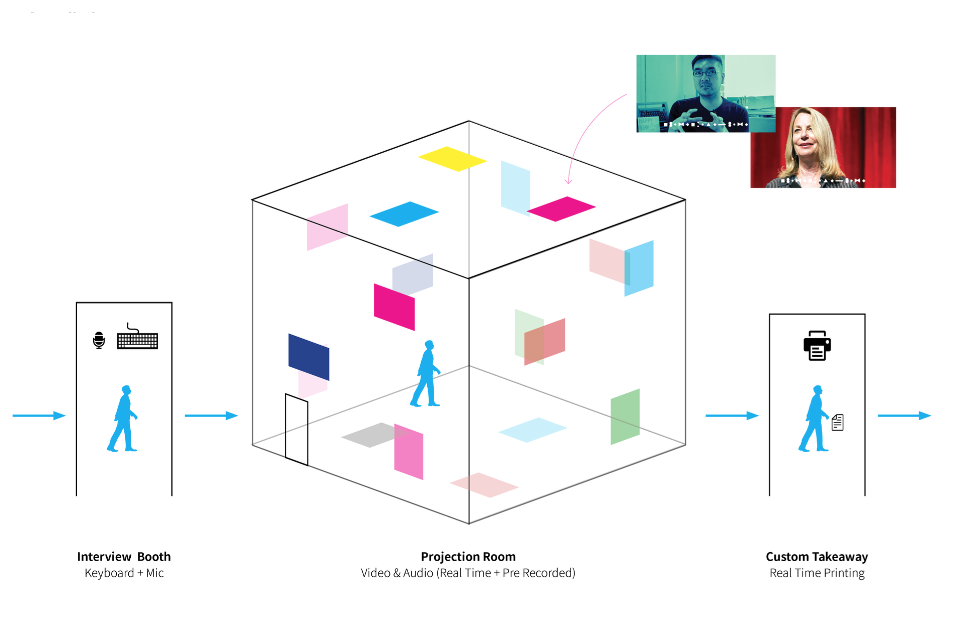
Design & Code: Participatory input
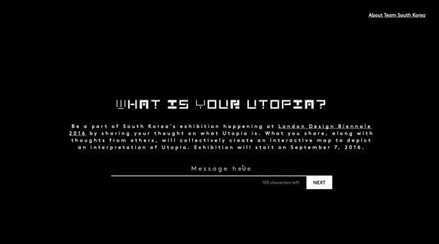
The main recipe we wanted to use to recreate the painting Mong Yu Do Won Do was modern day people's thoughts on what Utopia is. We designed the following ways to interact with the user to gather and understand their thoughts.
Input on-site
Providing a way for people visiting the biennale at London's Somerset House to add their thoughts
Providing a way for people visiting the biennale at London's Somerset House to add their thoughts
Input experience for onsite visitors at Somerset House in London
Web input
Opened up a website 10 days before the exhibition opening to allow people around the world to participate. Visitors came from all over the world including South Korea, United States, United Kingdom, Canada, Germany, Hong Kong, Netherlands, Singapore, and United Arab Emirates.
Opened up a website 10 days before the exhibition opening to allow people around the world to participate. Visitors came from all over the world including South Korea, United States, United Kingdom, Canada, Germany, Hong Kong, Netherlands, Singapore, and United Arab Emirates.
www.mongyudowon.com // Video on https://vimeo.com/180589684
Ideal portraits, floating around on the web
In a way, what people post online (such as on their Twitter feeds, Facebook posts, Instagram accounts) are about ideals they believe in or representation of how they want to be portrayed. They are a version each person's utopia. We brought these elements into the mix, starting from Twitter posts about Utopia.
In a way, what people post online (such as on their Twitter feeds, Facebook posts, Instagram accounts) are about ideals they believe in or representation of how they want to be portrayed. They are a version each person's utopia. We brought these elements into the mix, starting from Twitter posts about Utopia.
Data from a combination of these sources became the building blocks for our interactive visualization.
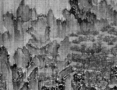
Design & Code: Mapping input to Landscape
The collection of thoughts around Utopia was used to recreate the landscape portrayed in the painting Mongyudowondo. We iterated through a number of design variations. To dynamically generate the landscape and the placement of individual thoughts, we've iterated through the different designs using live code.
Below are screenshots of the live code prototypes that we used to iterate through the designs. Designing through code was an integral part of the design iteration process. The graphic design members of the team also experimented with different ways to highlight the silhouette of the landscape using different visual explorations.
Below are screenshots of the live code prototypes that we used to iterate through the designs. Designing through code was an integral part of the design iteration process. The graphic design members of the team also experimented with different ways to highlight the silhouette of the landscape using different visual explorations.
Rather than randomizing the placement of each thought as a dot on the map, we wanted to add a story that fit in with the original painting. The original painting was composed of three perspectives.
The landscape becomes more utopia-like (or more ideal) as it points towards the right. Can that be a factor to guide how and where each dot should be placed on the interactive map? By leveraging the text analytics capability from Microsoft's Cognitive Services, we analyzed each thought to calculate it's sentiment value (how positive it is) and determined which coordinate to place it on the landscape.
How our exhibition grew over the course of 3 weeks at London Design Biennale with over 4000 thoughts from visitors
In additional, another key aspect of the experience to be able to view the thoughts the interactive map was comprised of. Three methods of interaction were explored:
- Trackpad interaction: Use the input device connected to the computer at the exhibition site to browse through the landscape
- Body gesture interaction: Use Microsoft Kinect to use arm and hand gestures to manipulate the landscape
- Mobile app interaction: Deploy a mobile application that anyone can download to enable browsing from everyone's smart phone
After building working prototypes for all three interactions, we scoped the V1 to the trackpad interaction. Body gesture and Mobile app are in the works for future updates.
Navigating and selecting a thought from the interactive map
Design & Code: Left and Right sides of Mong Yu Do Won Do
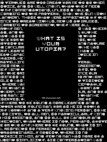
If the center piece of the exhibition was the landscape visualization of modern day thoughts on Utopia, the left and right sides were populated with flowing thoughts about Utopia. On the Left, Thomas More's Utopia is flowing continuously. On the Right, the collective thoughts from the world about Utopia is flowing continuously. By default, the flowing texts on both sides are represented using our custom Utopia typeface. When user hovers over each section, the pattern-oriented typeface translates to alphanumeric-oriented typeface for better readability.
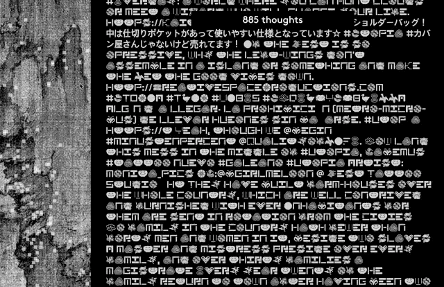
Right side of the interactive map
Public reveal in London
The exhibition piece "Peach Blossom" opened to the public on September 7, 2016 in London's Somerset House as part of London Design Biennale 2016. We are collecting thoughts from visitors around the world about what Utopia and observing how the landscape evolves as the number of shared thoughts increase.
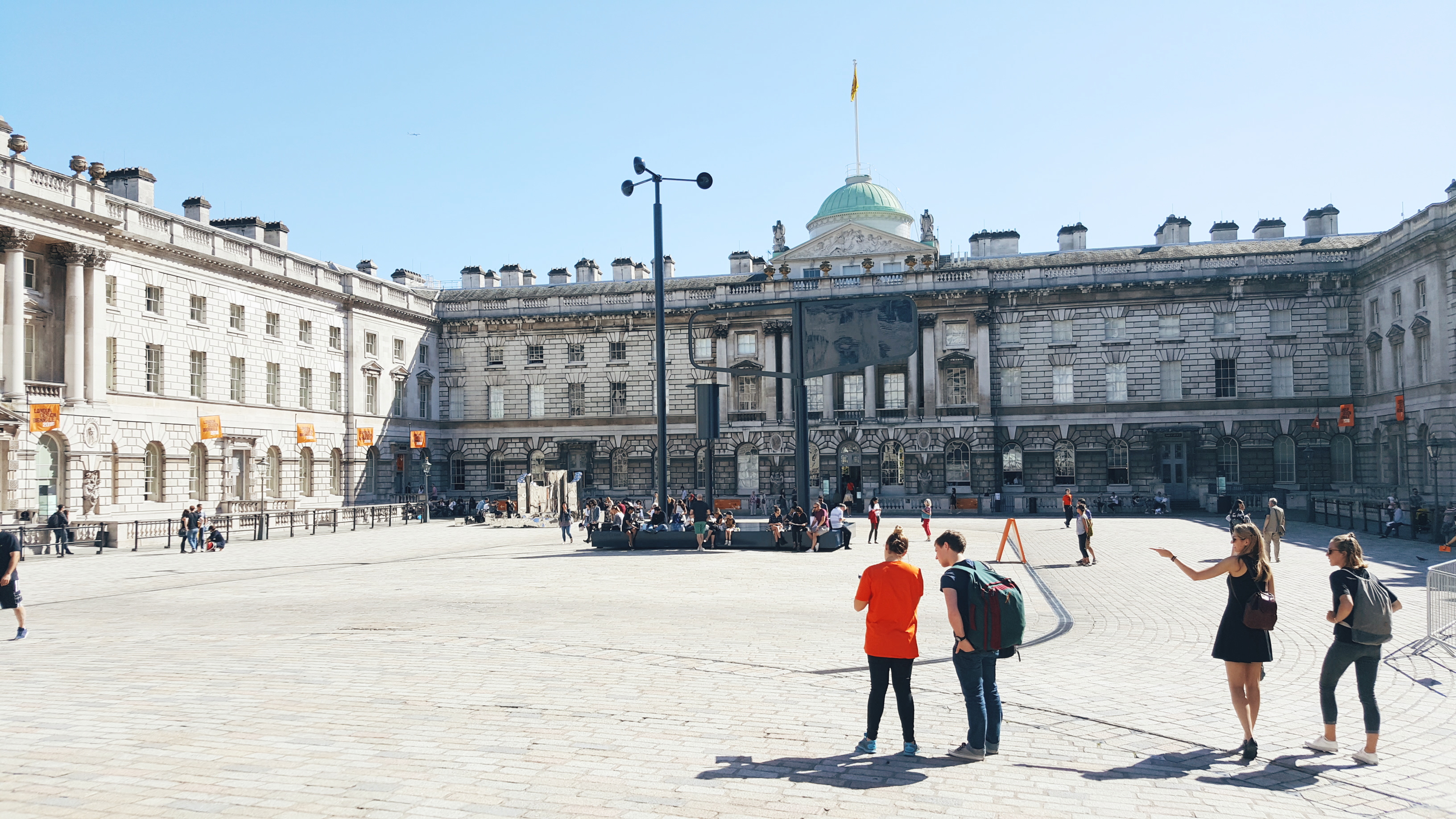
Visitors playing with the interactive landscape

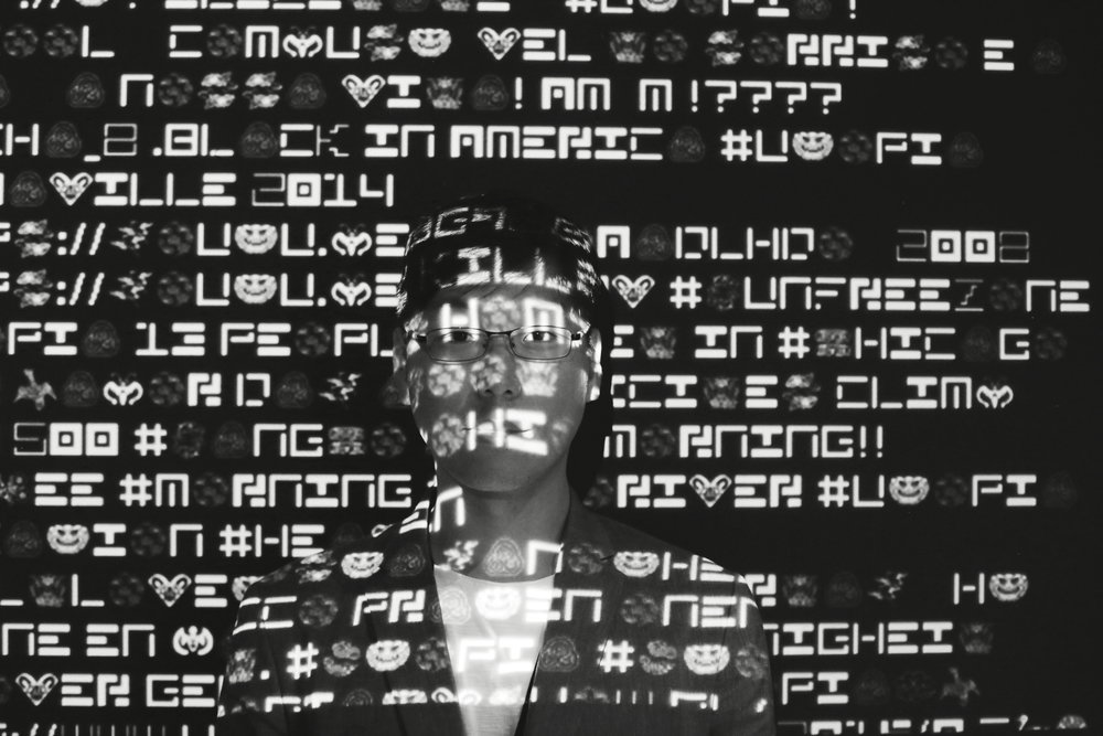
Left and right sides with the stream of flowing text became the photo zone for the visitors.
SOME OF MY FAVORITE RESPONSES FROM THE VISITORS TO "WHAT IS YOUR UTOPIA"
"I want to be Iron Man"
"Batman and Iron Man in a single cinematic universe"
"Good music resonates with everyone, regardless of gender, race, and nationality"
"peace and quiet and happiness. and maybe a burger"
Technologies
I chose to implement the key elements of this exhibition piece using web technologies for a number of reasons:
- To use a cloud database to collect data (User's thought on Utopia) across multiple surfaces including the On-site installation // www.mongyudowondo.com // and a mobile app coming in the future
- To tap into the publicly available feeds from different social network services such as Twitter
- To enable and optimize for motion designs we imagined, considering there will be thousands elements in a single view as more thoughts gather.
- To remotely control and push updates to the exhibition, since there will be times where none of the team members will be present on-site
Earlier prototypes included implementation using processing and manipulation through physical gestures using Microsoft Kinect.
Continuing to evolve
Looking forward, what's exciting is the collection of thoughts people will have shared by the end of the exhibition (By the 4th day since the opening, we've received over 1500 thoughts to our question "What is your Utopia?" By the end of the Biennale, we received over 4000 thoughts.). It will be interesting to review, analyze, tease out, and visualize patterns & trends among this collection.
From interaction design perspective, the next step will be evolving how people engage with "Peach Blossom" so that a larger number of the visitors can interact with the piece from whereever they are in the exhibition space.
From interaction design perspective, the next step will be evolving how people engage with "Peach Blossom" so that a larger number of the visitors can interact with the piece from whereever they are in the exhibition space.